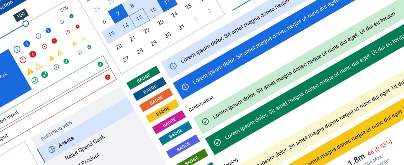
Goldman Sachs launched the Goldman Sachs Design System in February 2020 as part of our OneGS initiative. The Design System defines the visual styles, interaction patterns, and user experience guidelines to build modern websites and products for desktop and mobile experiences that unify the client experience across Goldman Sachs.
These experiences are built using the firm's User Interface (UI) Toolkit component library, a collection of templates, patterns, and over 60 "plug and play" JavaScript components. The UI Toolkit offers built-in support for Cross-Browser / Mobile, CSS-in-JS styling, and Accessibility features to empower developers across the firm to rapidly build out web applications. The quality of the UI Toolkit is measured not just by the visual appearance and efficiency of our components, but also by the developer experience that we provide to the teams using our product.
As a small example of attention to detail, the first iteration aligning the UI Toolkit to the Design System ensured that we had a consistent visual "look and feel", but the two products were not yet using consistent principles or vocabulary. Component features in the Design System did not necessarily match the APIs and implementation in the UI Toolkit. These discrepancies were natural as the products had grown organically, but it was not the quality of experience that we wanted to deliver to our designers and developers.
Is Lack of Standards an Issue?
The UI Toolkit is an evolving product that leverages open source and custom-made components to solve the common use cases and patterns in financial web applications. Our early focus on delivery to establish the product and meet developer needs did not afford us the chance to take a holistic look across all of our components, so we exposed different styles of API patterns and conventions. As a result, developers using the early version of the UI Toolkit would need to continually check the documentation to look up which features and APIs were available on each component. This added overhead to the development process when using the UI Toolkit to build an app.
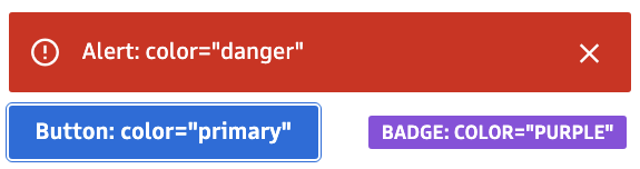
For instance, the color property from the old UI Toolkit APIs was a prime example of how lacking standardization can harm the developer experience. At that time we still leveraged Bootstrap under the hood, so values like primary and danger were acceptable as "colors" on many of our core components, such as Alert and Button. Other UI Toolkit components like Badge also had a color property, but here it accepted standard colors like purple or light-blue. Developers who had used the Badge color API were unpleasantly surprised to discover that passing purple to the Button color API (which only accepted 'primary' or 'secondary') failed silently and rendered a button without any background color.
<Badge color="purple" /> // This works since 'purple' is an acceptable parameter to Badge, as seen above.

<Button color="purple" /> // Fail, no background color was rendered, as seen above.
A Method to the Madness
We had many other examples of component features not quite lining up with each other. Aligning the UI Toolkit components to visually match the new GS Design System gave us an appreciation for the breadth of features that we support across the system. Having the full picture of what we were offering also gave us the perspective into why some components supported certain features, or even certain API values, that others did not.
For example, the color property used across the components was trying to do 3 things:
- Indicate a hierarchy of actions with values like primary and secondary
- Indicate a workflow status with values like info, success, warning, and danger
- Indicate a color from the color palette with values like purple or orange
This also explained why our components restricted certain values for the 'color' property:
Old APIs: Too many definitions of color.
Defining Intuitive APIs
APIs become intuitive when they do what you expect them to do, and they do it consistently.
The Little Manual of API Design is an excellent resource to get started building APIs with an awesome developer experience. The Manual outlines 5 characteristics to achieve when developing APIs:
- Easy to learn and memorize
- Leads to readable code
- Hard to misuse
- Easy to extend
- Complete
In the months following the launch, the UI Toolkit underwent a major transformation where we applied these principles and other software best practices to offer a set of component APIs that were intuitive to both designers and developers.
Uniting Design and Development
Before we could begin thinking about the best way to redefine our technical APIs, our designers and developers collaborated on a standard set of feature terminology that would be easily understood across designers and developers. By performing these exercises together, we improved the quality of new designs and decreased our time to market.
The engineering principles of "easy to learn and memorize", "hard to misuse", and "easy to extend" came in extremely handy here. We were able to break up features that were initially mutually exclusive in the GS Design System components by separating them out into individual properties. Breaking out features into shareable concepts also helped us find new opportunities to enhance existing components:
- A generic "categorization" feature of the Badge was simplified to Color, since its purpose was just changing the color of the component.
- A new Emphasis concept ('bold', 'subtle', or 'minimal') replaced the random "appearance" features to indicate the visual emphasis of the component on a web page.
- Size was standardized to 'small', 'medium' and 'large', and implemented for all components to provide consistency.
- New concepts like Shape ('circle' or 'square') and Placement ('top', 'bottom', etc.) emerged, with meaningful values that didn't require us to run back to our documentation notes to remember how they should be used.
The result of this collaboration led to the publication of our Design System Concepts. The concepts serve as a backbone for both the GS Design System and UI Toolkit to ensure component consistency across different systems. With this as a guide, refactoring the component APIs became a relatively straightforward exercise.
Evolving the GS UI Toolkit APIs
As a practical example, let's step through how we refactored the overloaded color property from the old APIs. As noted earlier, color was being used to represent 3 things: an action hierarchy, a status, and a standard color. This violates several of the characteristics of good APIs described in the Little Manual of API Design. APIs that are easy to learn and memorize "use the same name for the same concept, and different names for different concepts". Our color API was merging 3 concepts into one property, which made it confusing for developers to use properly. The color property also did not promote the hard to misuse characteristic, because developers would often try to provide standard colors as values and be forced to check the docs to learn that options like 'primary' or 'success' were the accepted values.
When redefining the APIs to solve this issue, we decided to refactor the old color API into three separate properties that can influence the final color of a component. The new APIs focus on the purpose of when each of these features would be needed on a component:
- Action Type describes the type of action to be taken - 'primary', 'secondary', or 'destructive'.
- Status provides visual context of the component state - 'information', 'success', 'warning', or 'error'.
- Color is redefined to only represent that standard colors present in the GS Design System color ramps - 'red', 'orange', 'yellow', etc.
Applying these new APIs to our components helped tighten their feature set to better reflect each components purpose. Button accepts action type and an optional status, but not the generic color property. Alert only needed status, and Badge can accept either status or color depending on its context. The new APIs also makes it easier to talk about the components with our designers and users in a way that mirrors their technical implementation. We can have conversations about the 'error' status Alert, the 'primary' action Button on the page, and the notification on the screen tagged with a 'purple' colored Badge.
The code becomes simpler as well:
<Alert status="error" />
<Button actionType="primary" />
<Badge color="purple" />
Hey, this sounds like English! And I can actually remember these prop names without needing to look at the docs every time!
Even better, when developers using the UI Toolkit decide to add an Avatar component to their app and find that it supports the color property, they know this prop will accept 'pink' or 'purple' just like the Badge. They can also infer that the Input component will accept 'success' and 'error' for its status prop, based on how status works in the Alert component. Adding consistency and predictability to the UI Toolkit APIs has enabled developers to infer their behavior with minimal reliance on the technical documentation.
Lessons Learned
Here are a few takeaways from our journey that you can apply to your own teams and products:
1. Understand your business and product
Knowing the market you operate in and the full set of features your product provides to users will enable you to make better technical decisions. Determining what your product does is the first step, but discovering why it does what it does will empower you to transform it.
2. Drive change together with your business
Change is scary. When software changes it often means more work for your users in the short-term, since people need to readjust their work habits and get used to new user interfaces. You may encounter a lot of user or business resistance when you start proposing software changes. Embrace their concerns and involve them in the discussions that will impact their workflows. You'll be surprised by the insights your users bring to the table when you collaborate.
3. Learn and apply software engineering best practices
Writing software that other people want to use takes practice. Leverage the wisdom of other engineers and consult early with peers to get feedback. References like the Little Manual of API Design, Clean Code, and Refactoring are great resources to explore.
Join Us!
See https://www.gs.com/disclaimer/global_email for important risk disclosures, conflicts of interest, and other terms and conditions relating to this blog and your reliance on information contained in it.
Solutions
Curated Data Security MasterData AnalyticsPlotTool ProPortfolio AnalyticsGS QuantTransaction BankingGS DAP®Liquidity Investing¹ Real-time data can be impacted by planned system maintenance, connectivity or availability issues stemming from related third-party service providers, or other intermittent or unplanned technology issues.
Transaction Banking services are offered by Goldman Sachs Bank USA ("GS Bank") and its affiliates. GS Bank is a New York State chartered bank, a member of the Federal Reserve System and a Member FDIC. For additional information, please see Bank Regulatory Information.
² Source: Goldman Sachs Asset Management, as of March 31, 2025.
Mosaic is a service mark of Goldman Sachs & Co. LLC. This service is made available in the United States by Goldman Sachs & Co. LLC and outside of the United States by Goldman Sachs International, or its local affiliates in accordance with applicable law and regulations. Goldman Sachs International and Goldman Sachs & Co. LLC are the distributors of the Goldman Sachs Funds. Depending upon the jurisdiction in which you are located, transactions in non-Goldman Sachs money market funds are affected by either Goldman Sachs & Co. LLC, a member of FINRA, SIPC and NYSE, or Goldman Sachs International. For additional information contact your Goldman Sachs representative. Goldman Sachs & Co. LLC, Goldman Sachs International, Goldman Sachs Liquidity Solutions, Goldman Sachs Asset Management, L.P., and the Goldman Sachs funds available through Goldman Sachs Liquidity Solutions and other affiliated entities, are under the common control of the Goldman Sachs Group, Inc.
Goldman Sachs & Co. LLC is a registered U.S. broker-dealer and futures commission merchant, and is subject to regulatory capital requirements including those imposed by the SEC, the U.S. Commodity Futures Trading Commission (CFTC), the Chicago Mercantile Exchange, the Financial Industry Regulatory Authority, Inc. and the National Futures Association.
FOR INSTITUTIONAL USE ONLY - NOT FOR USE AND/OR DISTRIBUTION TO RETAIL AND THE GENERAL PUBLIC.
This material is for informational purposes only. It is not an offer or solicitation to buy or sell any securities.
THIS MATERIAL DOES NOT CONSTITUTE AN OFFER OR SOLICITATION IN ANY JURISDICTION WHERE OR TO ANY PERSON TO WHOM IT WOULD BE UNAUTHORIZED OR UNLAWFUL TO DO SO. Prospective investors should inform themselves as to any applicable legal requirements and taxation and exchange control regulations in the countries of their citizenship, residence or domicile which might be relevant. This material is provided for informational purposes only and should not be construed as investment advice or an offer or solicitation to buy or sell securities. This material is not intended to be used as a general guide to investing, or as a source of any specific investment recommendations, and makes no implied or express recommendations concerning the manner in which any client's account should or would be handled, as appropriate investment strategies depend upon the client's investment objectives.
United Kingdom: In the United Kingdom, this material is a financial promotion and has been approved by Goldman Sachs Asset Management International, which is authorized and regulated in the United Kingdom by the Financial Conduct Authority.
European Economic Area (EEA): This marketing communication is disseminated by Goldman Sachs Asset Management B.V., including through its branches ("GSAM BV"). GSAM BV is authorised and regulated by the Dutch Authority for the Financial Markets (Autoriteit Financiële Markten, Vijzelgracht 50, 1017 HS Amsterdam, The Netherlands) as an alternative investment fund manager ("AIFM") as well as a manager of undertakings for collective investment in transferable securities ("UCITS"). Under its licence as an AIFM, the Manager is authorized to provide the investment services of (i) reception and transmission of orders in financial instruments; (ii) portfolio management; and (iii) investment advice. Under its licence as a manager of UCITS, the Manager is authorized to provide the investment services of (i) portfolio management; and (ii) investment advice.
Information about investor rights and collective redress mechanisms are available on www.gsam.com/responsible-investing (section Policies & Governance). Capital is at risk. Any claims arising out of or in connection with the terms and conditions of this disclaimer are governed by Dutch law.
To the extent it relates to custody activities, this financial promotion is disseminated by Goldman Sachs Bank Europe SE ("GSBE"), including through its authorised branches. GSBE is a credit institution incorporated in Germany and, within the Single Supervisory Mechanism established between those Member States of the European Union whose official currency is the Euro, subject to direct prudential supervision by the European Central Bank (Sonnemannstrasse 20, 60314 Frankfurt am Main, Germany) and in other respects supervised by German Federal Financial Supervisory Authority (Bundesanstalt für Finanzdienstleistungsaufsicht, BaFin) (Graurheindorfer Straße 108, 53117 Bonn, Germany; website: www.bafin.de) and Deutsche Bundesbank (Hauptverwaltung Frankfurt, Taunusanlage 5, 60329 Frankfurt am Main, Germany).
Switzerland: For Qualified Investor use only - Not for distribution to general public. This is marketing material. This document is provided to you by Goldman Sachs Bank AG, Zürich. Any future contractual relationships will be entered into with affiliates of Goldman Sachs Bank AG, which are domiciled outside of Switzerland. We would like to remind you that foreign (Non-Swiss) legal and regulatory systems may not provide the same level of protection in relation to client confidentiality and data protection as offered to you by Swiss law.
Asia excluding Japan: Please note that neither Goldman Sachs Asset Management (Hong Kong) Limited ("GSAMHK") or Goldman Sachs Asset Management (Singapore) Pte. Ltd. (Company Number: 201329851H ) ("GSAMS") nor any other entities involved in the Goldman Sachs Asset Management business that provide this material and information maintain any licenses, authorizations or registrations in Asia (other than Japan), except that it conducts businesses (subject to applicable local regulations) in and from the following jurisdictions: Hong Kong, Singapore, India and China. This material has been issued for use in or from Hong Kong by Goldman Sachs Asset Management (Hong Kong) Limited and in or from Singapore by Goldman Sachs Asset Management (Singapore) Pte. Ltd. (Company Number: 201329851H).
Australia: This material is distributed by Goldman Sachs Asset Management Australia Pty Ltd ABN 41 006 099 681, AFSL 228948 (‘GSAMA’) and is intended for viewing only by wholesale clients for the purposes of section 761G of the Corporations Act 2001 (Cth). This document may not be distributed to retail clients in Australia (as that term is defined in the Corporations Act 2001 (Cth)) or to the general public. This document may not be reproduced or distributed to any person without the prior consent of GSAMA. To the extent that this document contains any statement which may be considered to be financial product advice in Australia under the Corporations Act 2001 (Cth), that advice is intended to be given to the intended recipient of this document only, being a wholesale client for the purposes of the Corporations Act 2001 (Cth). Any advice provided in this document is provided by either of the following entities. They are exempt from the requirement to hold an Australian financial services licence under the Corporations Act of Australia and therefore do not hold any Australian Financial Services Licences, and are regulated under their respective laws applicable to their jurisdictions, which differ from Australian laws. Any financial services given to any person by these entities by distributing this document in Australia are provided to such persons pursuant to the respective ASIC Class Orders and ASIC Instrument mentioned below.
- Goldman Sachs Asset Management, LP (GSAMLP), Goldman Sachs & Co. LLC (GSCo), pursuant ASIC Class Order 03/1100; regulated by the US Securities and Exchange Commission under US laws.
- Goldman Sachs Asset Management International (GSAMI), Goldman Sachs International (GSI), pursuant to ASIC Class Order 03/1099; regulated by the Financial Conduct Authority; GSI is also authorized by the Prudential Regulation Authority, and both entities are under UK laws.
- Goldman Sachs Asset Management (Singapore) Pte. Ltd. (GSAMS), pursuant to ASIC Class Order 03/1102; regulated by the Monetary Authority of Singapore under Singaporean laws
- Goldman Sachs Asset Management (Hong Kong) Limited (GSAMHK), pursuant to ASIC Class Order 03/1103 and Goldman Sachs (Asia) LLC (GSALLC), pursuant to ASIC Instrument 04/0250; regulated by the Securities and Futures Commission of Hong Kong under Hong Kong laws
No offer to acquire any interest in a fund or a financial product is being made to you in this document. If the interests or financial products do become available in the future, the offer may be arranged by GSAMA in accordance with section 911A(2)(b) of the Corporations Act. GSAMA holds Australian Financial Services Licence No. 228948. Any offer will only be made in circumstances where disclosure is not required under Part 6D.2 of the Corporations Act or a product disclosure statement is not required to be given under Part 7.9 of the Corporations Act (as relevant).
FOR DISTRIBUTION ONLY TO FINANCIAL INSTITUTIONS, FINANCIAL SERVICES LICENSEES AND THEIR ADVISERS. NOT FOR VIEWING BY RETAIL CLIENTS OR MEMBERS OF THE GENERAL PUBLIC
Canada: This presentation has been communicated in Canada by GSAM LP, which is registered as a portfolio manager under securities legislation in all provinces of Canada and as a commodity trading manager under the commodity futures legislation of Ontario and as a derivatives adviser under the derivatives legislation of Quebec. GSAM LP is not registered to provide investment advisory or portfolio management services in respect of exchange-traded futures or options contracts in Manitoba and is not offering to provide such investment advisory or portfolio management services in Manitoba by delivery of this material.
Japan: This material has been issued or approved in Japan for the use of professional investors defined in Article 2 paragraph (31) of the Financial Instruments and Exchange Law ("FIEL"). Also, any description regarding investment strategies on or funds as collective investment scheme under Article 2 paragraph (2) item 5 or item 6 of FIEL has been approved only for Qualified Institutional Investors defined in Article 10 of Cabinet Office Ordinance of Definitions under Article 2 of FIEL.
Interest Rate Benchmark Transition Risks: This transaction may require payments or calculations to be made by reference to a benchmark rate ("Benchmark"), which will likely soon stop being published and be replaced by an alternative rate, or will be subject to substantial reform. These changes could have unpredictable and material consequences to the value, price, cost and/or performance of this transaction in the future and create material economic mismatches if you are using this transaction for hedging or similar purposes. Goldman Sachs may also have rights to exercise discretion to determine a replacement rate for the Benchmark for this transaction, including any price or other adjustments to account for differences between the replacement rate and the Benchmark, and the replacement rate and any adjustments we select may be inconsistent with, or contrary to, your interests or positions. Other material risks related to Benchmark reform can be found at https://www.gs.com/interest-rate-benchmark-transition-notice. Goldman Sachs cannot provide any assurances as to the materialization, consequences, or likely costs or expenses associated with any of the changes or risks arising from Benchmark reform, though they may be material. You are encouraged to seek independent legal, financial, tax, accounting, regulatory, or other appropriate advice on how changes to the Benchmark could impact this transaction.
Confidentiality: No part of this material may, without GSAM's prior written consent, be (i) copied, photocopied or duplicated in any form, by any means, or (ii) distributed to any person that is not an employee, officer, director, or authorized agent of the recipient.
GSAM Services Private Limited (formerly Goldman Sachs Asset Management (India) Private Limited) acts as the Investment Advisor, providing non-binding non-discretionary investment advice to dedicated offshore mandates, involving Indian and overseas securities, managed by GSAM entities based outside India. Members of the India team do not participate in the investment decision making process.